
Making Oncology Data Accessible for Patients
Project Snapshot
Company: McKesson / Ontada
Project
Designing a patient portal that translated complex oncology EHR data into an accessible interface for cancer patients.
Overview
McKesson / Ontada engaged the team to improve how oncology patients (primarily ages 50–70+) access and understand highly complex EHR data. The goal was to make clinical treatment information more understandable, usable, and less cognitively overwhelming for patients managing cancer care.
Role
Senior UX Designer - Led UX and interaction design across the patient portal experience, with responsibility for simplifying complex clinical data presentation and improving accessibility for an aging user base.
Key Problem
Cancer patients were expected to navigate dense, clinical EHR data that was not designed for patient comprehension, leading to confusion, cognitive overload, and difficulty managing treatment information.
Users
Cancer patients (primarily 50–70+)
Users managing ongoing treatment plans and clinical data in high-stress contexts
Key Contributions
UX and interaction design for patient-facing oncology portal
Adaptation of enterprise design system for accessibility and cognitive load reduction
Responsive design strategy across desktop, tablet, and mobile
Accessibility improvements focused on aging and high-stress users
Collaboration on translating clinical/EHR data into patient-friendly experiences
Key Outcomes / Highlights
Simplified complex oncology EHR data into a patient-centered interface, improving comprehension and usability
Reduced navigation friction, with user feedback indicating faster access to key tasks like appointments and messages
Improved perceived usability scores through embedded feedback (majority of responses rating experience as “clear” or “easy to use”)
Increased accessibility and readability for aging users (50–70+), reflected in reduced reported confusion around navigation and terminology
Established scalable navigation and dashboard patterns for future patient-facing tools within the Ontada platform
Ontada Health Patient Portal Homepage - Live
Project Overview
While working at McKesson, I helped design a new patient portal for the Ontada oncology platform. Ontada’s primary product was a complex Electronic Health Record (EHR) system used by oncologists to manage cancer patient care.
The goal of the project was to extend that system to patients by creating a portal that allowed them to view their medical information, track treatment progress, and access key health records.
Unlike the clinician-facing software, this new product needed to be usable by a broad public audience — including many cancer patients between the ages of 50 and 70 who may experience cognitive fatigue or memory issues during treatment.
This required translating highly complex clinical data into an experience that was simple, accessible, and supportive for patients managing serious health conditions.
The Design Challenge
Designing the patient portal introduced several new challenges for the Ontada platform.
The existing EHR system was built for trained healthcare professionals working in controlled clinical environments. The new portal, however, needed to be accessible to patients with varying levels of technical comfort and health literacy.
Several key challenges shaped the design approach:
A New Audience
Unlike clinicians, patients interacting with the portal could have limited technical experience and may be managing cognitive fatigue related to cancer treatment. The interface needed to prioritize clarity, simplicity, and reassurance.
Translating Complex Medical Data
The portal pulled information directly from the underlying EHR system. Medical records, treatment schedules, and clinical terminology had to be presented in ways that patients could easily understand.
Design System Adaptation
The existing design system was optimized for dense clinical workflows. Significant updates were required to support clearer visual hierarchy, improved readability, and more accessible interaction patterns.
Responsive Design Requirements
The clinician-facing EHR was designed primarily for desktop use. The patient portal needed to function seamlessly across desktops, laptops, tablets, and mobile devices.
Research Limitations
Traditional user research methods were difficult to conduct because the target users were cancer patients undergoing treatment. Many potential users did not have the time or energy to participate in interviews or usability testing.
These constraints required the team to adapt our research methods and rely on a combination of secondary research, clinical insights, and iterative design validation.
Research
Understanding the Users
Conducting direct research with cancer patients proved challenging. Many potential users were actively undergoing treatment and were understandably unable or unwilling to participate in extended interviews or usability sessions.
To better understand patient needs, the team relied on several alternative research approaches.
Clinical Collaboration
We worked closely with oncology clinicians and care coordinators who regularly interact with patients navigating treatment information. Their insights helped us understand the types of questions patients frequently ask and where confusion commonly occurs.
Review of Patient Resources
We reviewed existing patient education materials and analyzed common support requests to identify patterns in how patients interpret and search for medical information.
Competitive Analysis
We also conducted a competitive analysis of existing patient portals, focusing primarily on Epic MyChart, one of the most widely used healthcare patient portals. This analysis helped us understand common interaction patterns, navigation structures, and information hierarchies used in patient-facing healthcare applications.
The review provided useful benchmarks while also highlighting opportunities to simplify navigation and improve readability for oncology patients who may be experiencing fatigue or cognitive strain during treatment.
Embedded User Feedback
Because early-stage user interviews were limited, we implemented a Feedback button on every page of the portal. This allowed patients to quickly report issues or share feedback while actively using the system.
The feedback button opened a short, anonymous four-question survey where users could:
• Rate overall usability
• Rate site functionality
• Describe any problems they encountered
• Provide additional feedback about their experience
This approach allowed us to gather real-time feedback directly from patients interacting with the portal and helped identify usability issues that could be addressed in future iterations.
Key Insights
These combined research methods helped identify several common challenges patients face when navigating their care information:
• Confusion around medical terminology
• Difficulty tracking treatment progress
• Anxiety when interpreting clinical data
• The need for quick access to key information such as appointments and messages
These insights ultimately helped shape the portal’s design priorities around clarity, simplicity, and reduced cognitive load.
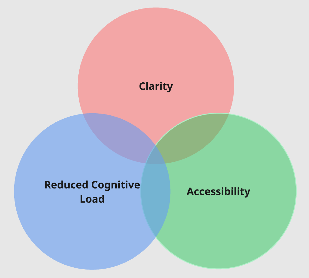
Design Strategy
To make complex oncology data accessible to patients, the design focused on three principles:
Clarity - Medical data needed to be presented in ways that were easy to understand without clinical training.
Reduced Cognitive Load - The interface needed to support patients experiencing fatigue, stress, or memory difficulties.
Accessibility - Typography, spacing, and interaction patterns were optimized for readability and ease of use.
Key Design Decisions
Because the portal served patients managing complex health conditions, the design focused heavily on clarity, navigation simplicity, and accessibility.
Five areas became central to the experience:
The homepage
The navigation structure
Accessibility and readability
Balancing user and stakeholder priorities
Designing for multiple devices
Homepage Design
The homepage served as the central entry point to the patient portal and needed to provide patients with a clear overview of their care without overwhelming them with complex medical information.
Early design concepts explored several approaches to presenting patient data, including more comprehensive dashboards that surfaced a wide range of clinical information. However, these approaches quickly introduced challenges around readability and cognitive load for the intended audience.
Because many users were cancer patients who may be experiencing fatigue, stress, or treatment-related cognitive difficulties, the design ultimately prioritized simplicity and clarity over data density.
The final dashboard focused on surfacing the information patients most frequently needed to access:
Upcoming appointments
Medical records and lab results
Messages from their care provider
Care team information
Forms to be completed before upcoming visits
Access to billing information
Rather than presenting large volumes of medical data, the homepage was designed to act as a guided entry point that helped patients quickly identify important updates and navigate to the areas most relevant to their care.
This approach allowed patients to understand their current status at a glance while reducing the cognitive effort required to interact with the portal.
Navigation Structure
Designing the navigation for the patient portal required balancing two competing needs: providing quick access to the information patients needed most often while preventing the interface from becoming overwhelming.
Because many users were managing cancer treatment and could be experiencing fatigue or cognitive strain, the navigation needed to be simple, predictable, and easy to understand at a glance.
To achieve this, the navigation was divided into two levels: Primary Navigation and Administrative Navigation.
Primary Navigation
The Primary Navigation focused on the core areas that patients would access regularly. Rather than using traditional menus or nested navigation patterns, we designed a set of six large navigation buttons supported by clear iconography and descriptive labels.
The primary sections included:
For Me – the patient’s personal dashboard and homepage
Medical Records – access to key health information and documentation
Appointments – upcoming visits and scheduling information
Messages – communication with the care team
Care Team – information about providers and care contacts
Menu – access to additional administrative options
These primary navigation items were designed with large clickable targets and clear visual hierarchy so patients could quickly recognize and access the areas they needed without interpreting complex menus.
The For Me dashboard served as the central landing page, giving patients a quick overview of their care and directing them to important updates.
Administrative Navigation
While the portal included additional features such as account settings and caregiver management, these were not tasks patients needed to access frequently.
To prevent the interface from becoming cluttered, these functions were separated into an Administrative Navigation panel that could be accessed through the Menu button.
Selecting the Menu triggered a slide-out panel containing secondary features such as:
Communication preference settings
Caregiver access management
Account information
Additional profile options
By separating these administrative tools from the primary navigation, the interface remained focused on the information patients needed most often while still providing access to supporting functionality when necessary.
This structure helped maintain a clean, approachable interface while reducing cognitive load for patients interacting with the portal.
Accessibility and Readability
Given the patient demographic, accessibility was a critical design priority. Several changes were introduced to support patients who may experience cognitive fatigue or reduced focus during treatment:
Increased text size and line spacing for readability
Clear visual hierarchy to guide attention
Simplified interaction patterns to reduce cognitive load
High contrast UI elements for improved visibility
These changes required significant updates to the existing design system, which had previously been optimized for clinician workflows rather than patient use.
Balancing User and Stakeholder Priorities
Another challenge during the homepage design process was balancing the needs of two important groups: patients using the portal and organizational stakeholders responsible for healthcare operations.
User research and internal discussions revealed that patients were primarily looking for quick access to information related to their care, such as:
Messages from their providers
Upcoming appointments
Recent medical records or lab results
Care team contact information
However, internal stakeholders emphasized the importance of surfacing additional operational elements on the homepage, including:
Appointment reminders
Forms that needed to be completed before upcoming visits
Billing access
One area that required particularly careful consideration was billing visibility. Some stakeholders initially proposed displaying the patient’s current balance directly on the homepage.
After discussion, the design team raised concerns that repeatedly displaying a growing medical balance could create unnecessary stress for patients who were already managing a serious illness. Because many patients would be logging in primarily to review test results or communicate with their care team, presenting financial information prominently on the dashboard risked adding emotional strain during those interactions.
Instead, we chose a more balanced solution: the homepage included a Billing section that provided quick access to billing tools, but detailed financial information such as outstanding balances and due dates was placed deeper within the portal.
This approach allowed patients to easily access billing when needed while keeping the primary dashboard focused on their care and treatment.
Designing for Multiple Devices
Unlike the clinician-facing EHR, which was primarily used on desktop systems within clinical environments, the patient portal needed to support a wide range of devices.
The interface was designed to work seamlessly across:
Desktop computers
Laptops
Tablets
Mobile phones
Responsive layouts ensured patients could access their health information regardless of how they chose to connect.
Outcome
The patient portal successfully launched as part of the Ontada platform, providing oncology patients with direct access to their care information.
Key outcomes included:
Patients were able to more quickly locate key information such as appointments, messages, and medical records
Feedback submissions showed improved clarity and reduced confusion around navigation and terminology
The simplified dashboard and navigation structure reduced cognitive load for users managing treatment-related fatigue
The embedded feedback system enabled continuous usability improvements and surfaced actionable issues early
Design system updates improved consistency and scalability across patient-facing experiences
Design System updates inside Figma
Responsive design requirements for the navigation in the design system
Design Impact
The patient portal represented a significant shift for Ontada, moving from a clinician-focused EHR environment to a patient-facing platform designed for accessibility and clarity.
The design approach prioritized reducing cognitive load and simplifying complex medical information so patients could more easily understand and manage their care.
Key contributions of the design included:
A simplified dashboard highlighting the most critical patient information
Navigation designed around patient priorities rather than clinical workflows
Accessible UI patterns adapted for an older patient demographic
A responsive design that allowed patients to access their care information across desktop, tablet, and mobile devices
A built-in feedback system that enabled continuous usability improvements based on real patient input
This work helped establish a foundation for future patient-facing tools within the Ontada platform.
Reflection
Designing for cancer patients required a different approach than typical enterprise software. Patients accessing the portal were often experiencing fatigue, anxiety, or cognitive strain during treatment, which made clarity and simplicity essential.
This project reinforced the importance of designing healthcare tools that reduce complexity and support users during some of the most stressful moments of their lives.
Research on cognitive impacts for cancer patients
Competitive analysis - Epic MyChart
Feedback Survey to gather patient input
Strategy diagram
Homepage wireframe
Homepage Final
Primary navigation examples
Administrative navigation examples
Examples of the three font sizes built into the site
Handwritten notes from the discussion around Patient and stakeholder priorities
Example of the responsive layouts created for each page.